Наблюдательный login form html. HTML Формы
Здравствуй, дорогой хабрадруг! В этом туториале мы научимся создавать две формы HTML5: форма входа и форма регистрации. Эти формы будут меняться друг с другом местами с помощью псевдо-класса CSS3 :target . Мы будем использовать CSS3 и шрифт с иконками. Идея этого демо в том, чтобы показать пользователю форму входа и предоставить ему ссылку “перехода” к форме регистрации.
В этом туториале я подробно расскажу о том, как создавать эффект как в Демо 1 .
HTML
Здесь мы использовали несколько приемов HTML5. Например, элемент type=password автоматически скрывает то, что пользователь печатает и заменяет символы точками или звездочками (зависит от браузера). Элемент type=email позволяет браузеру проверить правильность формата email адреса. Кроме того, мы использовали параметр require=required ; браузеры, поддерживающие данный параметр не позволят пользователю отправить форму до тех пор, пока поле не заполнено, JavaScript здесь не требуется. Параметр autocomplete=on будет автоматически заполнять некоторые поля. Мы также использовали замещающийся текст, который поможет пользователю при заполнении формы.
Теперь о двух хитрых моментах. Вы наверное заметили две ссылки в начале формы. Этот ловкий прием позволит нашей формы вести себя правильно при работе с якорями (anchors).
Второй момент связан с применением шрифта с иконками. Мы будем использовать data-attribute , чтобы отобразить иконки. Устанавливая параметр data-icon=”icon_character” с соответствующим символов в HTML, мы должны назначить лишь одно правило в CSS для установления стиля всех иконок. Подробнее об этом приеме можно почитать на сайте: 24 Ways: Displaying Icons with Fonts and Data- Attributes .
CSS
Для чистоты кода я пропущу базовые параметры (html, body и т.п.), но вы сможете найти их в исходных файлах. Повторяю, что я использую приемы CSS3, которые не будут работать во всех браузерах. Итак, давайте же приступим!Стилизуем формы, используя CSS3
Во-первых, давайте назначим нашим формам базовый стиль.#subscribe, #login{ position: absolute; top: 0px; width: 88%; padding: 18px 6% 60px 6%; margin: 0 0 35px 0; background: rgb(247, 247, 247); border: 1px solid rgba(147, 184, 189,0.8); box-shadow: 0pt 2px 5px rgba(105, 108, 109, 0.7), 0px 0px 8px 5px rgba(208, 223, 226, 0.4) inset; border-radius: 5px; } #login{ z-index: 22; }
Здесь мы назначим свойства для шапки:
/**** текст ****/ #wrapper h1{ font-size: 48px; color: rgb(6, 106, 117); padding: 2px 0 10px 0; font-family: "FranchiseRegular","Arial Narrow",Arial,sans-serif; font-weight: bold; text-align: center; padding-bottom: 30px; } /** На донный момент только webkit поддерживает background-clip:text; **/ #wrapper h1{ background: -webkit-repeating-linear-gradient(-45deg, rgb(18, 83, 93) , rgb(18, 83, 93) 20px, rgb(64, 111, 118) 20px, rgb(64, 111, 118) 40px, rgb(18, 83, 93) 40px); -webkit-text-fill-color: transparent; -webkit-background-clip: text; } #wrapper h1:after{ content:" "; display:block; width:100%; height:2px; margin-top:10px; background: linear-gradient(left, rgba(147,184,189,0) 0%, rgba(147,184,189,0.8) 20%, rgba(147,184,189,1) 53%, rgba(147,184,189,0.8) 79%, rgba(147,184,189,0) 100%); }
Замечу, что сегодня только браузеры с webkit поддерживают background-clip: text , поэтому мы сделаем полосатый фон только для webkit и привяжем его к заголовку H1. Так как параметр background-clip: text работает только в Webkit браузерах, я решил работать только со свойствами webkit. Именно поэтому я разделил CSS на две части и использовал только градиент webkit. Однако вы не должны использовать лишь webkit на своих вебсайтах! Так, например, параметр -webkit-text-fill-color: transparent позволяет нам иметь прозрачный фон, но только для браузеров webkit, все другие браузеры проигнорируют это свойство.
Мы также создали тонкую линию под заголовком с помощью элемента:after pseudo-class. Мы использовали градиент с 2px в высоту и уменьшили прозрачность по краям до нуля.
Теперь давайте позаботимся о полях ввода и придадим им приятный вид.
/**** advanced input styling ****/ /* placeholder */ ::-webkit-input-placeholder { color: rgb(190, 188, 188); font-style: italic; } input:-moz-placeholder, textarea:-moz-placeholder{ color: rgb(190, 188, 188); font-style: italic; } input { outline: none; }
Во-первых, мы стилизуем поля и уберем обводку. Но будьте осторожны: обводка помогает пользователю понять, на каком поле он находится. Если же вы уберете ее, то нужно применить свойства:active и:focus.
/* все поля исключают submit и checkbox */ #wrapper input:not(){ width: 92%; margin-top: 4px; padding: 10px 5px 10px 32px; border: 1px solid rgb(178, 178, 178); box-sizing: content-box; border-radius: 3px; box-shadow: 0px 1px 4px 0px rgba(168, 168, 168, 0.6) inset; transition: all 0.2s linear; } #wrapper input:not():active, #wrapper input:not():focus{ border: 1px solid rgba(91, 90, 90, 0.7); background: rgba(238, 236, 240, 0.2); box-shadow: 0px 1px 4px 0px rgba(168, 168, 168, 0.9) inset; }
Здесь мы использовали псевдо класс:not, чтобы стилизовать все поля, кроме чекбоксов. Кроме того, я решил убрать обводку и добавил свойства:focus и:active.
Теперь время веселиться: шрифт с иконками. Так как мы не можем использовать псевдо-классы:before и:after, мы добавим иконку в параметр label, а затем разместим в поле. Я буду использовать библиотеку fontomas . Вы можете сами сопоставить иконки с соответствующей буквой. Помните атрибут data-icon ? Именно в него нужно вставить букву. Я использовал data-icon=’u’ для логина, ‘e’ для email, ‘p’ для пароля. Как только я выбрал буквы, я скачал шрифт и использовал генератор шрифтов fontsquirrel для конвертации в формат, пригодный для @font-face.
@font-face { font-family: "FontomasCustomRegular"; src: url("fonts/fontomas-webfont.eot"); src: url("fonts/fontomas-webfont.eot?#iefix") format("embedded-opentype"), url("fonts/fontomas-webfont.woff") format("woff"), url("fonts/fontomas-webfont.ttf") format("truetype"), url("fonts/fontomas-webfont.svg#FontomasCustomRegular") format("svg"); font-weight: normal; font-style: normal; } /** магический трюк! **/ :after { content: attr(data-icon); font-family: "FontomasCustomRegular"; color: rgb(106, 159, 171); position: absolute; left: 10px; top: 35px; width: 30px; }
Вот собственно и все. Вам не требуется иметь отдельный класс для каждой иконки. Мы использовали параметр content: attr(data-icon) , чтобы получить букву из атрибута data-icon. Таким образом, нам нужно лишь назначить шрифт, выбрать цвет и разместить иконку.
Теперь назначим правила для кнопки отправки формы.
/*стилизуем обе кнопки*/ #wrapper p.button input{ width: 30%; cursor: pointer; background: rgb(61, 157, 179); padding: 8px 5px; font-family: "BebasNeueRegular","Arial Narrow",Arial,sans-serif; color: #fff; font-size: 24px; border: 1px solid rgb(28, 108, 122); margin-bottom: 10px; text-shadow: 0 1px 1px rgba(0, 0, 0, 0.5); border-radius: 3px; box-shadow: 0px 1px 6px 4px rgba(0, 0, 0, 0.07) inset, 0px 0px 0px 3px rgb(254, 254, 254), 0px 5px 3px 3px rgb(210, 210, 210); transition: all 0.2s linear; } #wrapper p.button input:hover{ background: rgb(74, 179, 198); } #wrapper p.button input:active, #wrapper p.button input:focus{ background: rgb(40, 137, 154); position: relative; top: 1px; border: 1px solid rgb(12, 76, 87); box-shadow: 0px 1px 6px 4px rgba(0, 0, 0, 0.2) inset; } p.login.button, p.signin.button{ text-align: right; margin: 5px 0; }
Трюк заключается в том, чтобы использовать box-shadow, чтобы создать несколько рамок. Естественно, вы можете использовать лишь одну рамку, но также можно и несколько. Мы будем использовать параметр length для создания “фейковой” второй белой рамки, 3px в ширину, без размытия.
Теперь стилизуем чекбокс, здесь мы ничего необычного не сотворим:
/* стилизуем чекбокс "запомнить меня"*/ .keeplogin{ margin-top: -5px; } .keeplogin input, .keeplogin label{ display: inline-block; font-size: 12px; font-style: italic; } .keeplogin input#loginkeeping{ margin-right: 5px; } .keeplogin label{ width: 80%; }
Стилизуем подвал формы, используя множественные линейные градиенты, чтобы создать полосатый градиент.
P.change_link{ position: absolute; color: rgb(127, 124, 124); left: 0px; height: 20px; width: 440px; padding: 17px 30px 20px 30px; font-size: 16px ; text-align: right; border-top: 1px solid rgb(219, 229, 232); border-radius: 0 0 5px 5px; background: rgb(225, 234, 235); background: repeating-linear-gradient(-45deg, rgb(247, 247, 247) , rgb(247, 247, 247) 15px, rgb(225, 234, 235) 15px, rgb(225, 234, 235) 30px, rgb(247, 247, 247) 30px); } #wrapper p.change_link a { display: inline-block; font-weight: bold; background: rgb(247, 248, 241); padding: 2px 6px; color: rgb(29, 162, 193); margin-left: 10px; text-decoration: none; border-radius: 4px; border: 1px solid rgb(203, 213, 214); transition: all 0.4s linear; } #wrapper p.change_link a:hover { color: rgb(57, 191, 215); background: rgb(247, 247, 247); border: 1px solid rgb(74, 179, 198); } #wrapper p.change_link a:active{ position: relative; top: 1px; }
Сейчас вы видите, что у нас две приятные формы, но ведь мы хотим, чтобы отображалась только лишь одна из них. Пришло время анимации!
Создаем анимацию
Первое, что мы сделаем, мы спрячем вторую форму, назначив opacity на 0:#register{ z-index: 21; opacity: 0; }
Помните, что форма входа имеет параметр z-index: 22? Второй форме мы назначим этот параметр на 21, чтобы поставить его “под” форму входа.
Теперь самое интересное: меняем формы местами, используя псевдо класс:target. Вам нужно понять одну вещь по поводу:target: для перемещения мы будем использовать якоря. Нормальное поведение якоря - прыжок на определенный элемент страницы. Но мы не хотим этого, мы лишь хотим поменять формы местами. И тут приходит на помощь наш трюк с использованием двух ссылок в начале страницы. Вместо того, чтобы направить нас прямо на вторую форму, рискуя испытать эффект “прыжка”, мы придадим ссылкам параметр display: none . Это поможет избежать прыжков. Я обнаружил этот трюк на сайте: CSS3 create (французский язык).
#toregister:target ~ #wrapper #register, #tologin:target ~ #wrapper #login{ z-index: 22; animation-name: fadeInLeft; animation-delay: .1s; }
Вот, что происходит: когда мы кликаем на кнопку Присоединиться
, мы направляемся на #toregister. Затем происходит анимация и лишь потом переходим на элемент #register. Мы используем анимацию под названием fadeInLeft
. Так как мы “прячем” форму, используя нулевую прозрачность, мы применим анимацию, которая будем постепенно появляться. Мы также изменили z-index, чтобы она появилась поверх другой формы. То же самое происходит для другой формы same happens for the other form.
Вот код для анимации. Мы использовали CSS3 animation framework от Dan Eden и адаптировали этот фреймворк под наш туториал.
Animate{ animation-duration: 0.5s; animation-timing-function: ease; animation-fill-mode: both; } @keyframes fadeInLeft { 0% { opacity: 0; transform: translateX(-20px); } 100% { opacity: 1; transform: translateX(0); } }
Форма, которая “исчезает”, будет иметь анимацию затемнения влево:
#toregister:target ~ #wrapper #login, #tologin:target ~ #wrapper #register{ animation-name: fadeOutLeftBig; } @keyframes fadeOutLeft { 0% { opacity: 1; transform: translateX(0); } 100% { opacity: 0; transform: translateX(-20px); } }
Теперь вы можете использовать другие анимации от Dan Eden’ с помощью файла animate.css: просто измените класс.animate class и названия анимаций. Вы также обнаружите несколько других анимаций в конце файла animate-custom.css file.
Вот и все, друзья. Надеюсь вам понравился этот туториал!
Заметим, что в некоторых браузерах параметр background-clip: text не поддерживается. В Internet Explorer 9 анимации не работают. В Internet Explorer 8 и ниже псевдо-класс:target pseudo-class не поддерживается, поэтому там этот эффект вообще работать не будет.
P.S. Все замечания по поводу перевода с удовольствием приму в личку. Спасибо!
Теги: Добавить метки
Поле для ввода пароля - обычное текстовое поле, вводимый текст в котором в зависимости от браузера отображается звёздочками или точками. Такая особенность предназначена для того, чтобы никто не подглядел вводимый пароль. Хотя вводимый текст и не показывается на экране, на сервер введённая информация передаётся в открытом виде без шифрования. Поэтому использование этого поля не обеспечивает безопасности данных и их можно перехватить.
Синтаксис создания следующий.
Атрибуты совпадают с атрибутами текстового поля и перечислены в табл. 1.
Поле для пароля нашло широкое применение на сайтах для авторизации пользователей и разграничения доступа к разделам сайта, где требуется подтвердить свои полномочия. В примере 1 показано, как создавать подобные поля.
Пример 1. Поле с паролем
В результате получим следующее (рис. 1).
Рис. 1. Вид поля с паролем
К полю с паролем применимы стилевые свойства задающие параметры цвета, фона, рамки и др. В примере 2 показано добавление фоновых картинок к полям формы. За основу возьмём стиль как для текстовых полей.
Пример 2. Добавление изображения в текстовое поле
Результат данного примера показан на рис. 2. Картинки добавляются в качестве фона, поэтому текст обязательно надо сдвинуть вправо через padding-left , в противном случае он будет выводиться поверх изображения.
Share
Have you minutely ever followed the login page that appears when you sign up for a particular website? The first page that comes up whenever you are logging in is the first impression of a website. The design of the login form will itself define the nature of the website and hence it should carry pertinence with the website it is leading to.
Truly, login or signup forms are one of the most important elements that a web page contains and hence designing these online forms is one of the most significant features when it comes to designing the website. A successfully created sign up form also encourages as well as allows the visitors to becoming a member, a subscriber or a customer for a particular business. A sober-looking, creative as well as visually attractive signup form will surely encourage a fruitful rate of conversion of a visitor if all the other features are properly coordinated.
Designing an effective as well as clean login/signup form asks for a lot of creativity from the designer as it is important for a website to have an appealing & outstanding form for the sake of its success and efficacy.
Some highly effective and attractive login form designs
There are some registration forms which consist of basic that are created with the help of some elementary web designing concepts. Apart from these elementary ones, there are few which may look a bit different o some extent. However, there are some others which are extremely impressive as well as creative that categorically lures the visitor to enter the website.
Some of these forms have an option of entering personal contact information in details and they include the name, e-mail, contact number and other things . The styles of these forms go much beyond ordinary, and some of them even have come up with an option of handwritten calligraphy.
Few login pages come up with various innovative input style of text beside some highly innovative option or select menus. These types of forms really ask for a high level of creativity from the designers, especially when it comes to designing the space in between various layers, creating texts that are large and easily readable, and creating the sidebar links that connect to their e-mails directly.
A specific type of form provides a dramatic insight of a new data input field. The users have the leverage of getting to the login link from the homepage itself and call up a login box powered by jQuery. This particular type of form comes up with an Ajax that it uses to direct an external script of PHP. It evaluates the information that a user has used in logging in and once processed, it either grants the permission to the user or denies it.
A number of login form designs that we see these days are indeed extremely dynamic and consist of some of the very latest designs. One of these new age designs provides a wonderful insight into the various data input fields. Users can easily go to the homepage and can click the link on the login page to call up a dynamic login box powered by jQuery. This particular login form comes up with the option of linking an external PHP script that helps in evaluation of various login information and depending upon the outcome of the result; it either allows entry of the user or denies it.
Login Form Examples
Login Form from Impressionist UI by Designmodo
Although, at first sight, it seems that inputs slightly soar in the air, since gradients and vector realization placed on a textured canvas leads to a slight balanced in harmony. Nevertheless, this tooltip-inspired basic login form looks interesting and unique.
Login by Haziq Mir
The designer places fields in line, making the overall component suitable for standard relatively narrow headers. While soft, warm brownish coloring paired with inner shadows give each item pleasant, smooth and finished appearance, the dark version has a more sophisticated look.
Stellar Login, Improved by Haziq Mir
The first thing that catches the eye is a background that can become an excellent complement to any intricate or illustrative design, where natural textures such as wood or paper run the show. While sleek inputs and grayish coloring ideally suit to the notebook-styled canvas, the huge blue ‘Sign In’ button grabs the whole attention with its great visual weight.
Login Form by Sergey Shmidt
This is an excellent example of a dark login form that exudes an image of sophistication without being brutal. The glossy brown button instantly strikes the eye, calling to action. Tiny metallic toggle adds a lovely skeuomorphic flair to the composition.
Login form for personal application by Ionut Zamfir
The backdrop of the form mimics a common notebook surface where we usually make notes. Wooden canvas enhances the overall aesthetics. Although shiny gradient buttons slightly break away from the theme, here flat or sketchy buttons might look more natural, yet still the component achieves a sense of harmony.
Sign In Widget
The designer exhibits a subtle and elegant web form, the wow factor of which is produced by its semi-transparent background. It has an optimal contrast that sets apart lettering and icons from the backdrop, and as usual, massive almost overwhelming bulging CTA.
iPhone App Login Form
iPhone App Login Form by Mason Yarnell is executed in the best traditions of iOS designs of previous years. There are lots of glossy stuff, ornamental ribbons, embossed icons and, of course, complicated textured backdrop. Nevertheless, in general, the component looks clean, fresh and with lots of air.
Light login by Maxwell Barvian
Light login by Maxwell Barvian looks exactly as stated on the nameplate: light, clean and crisp. Grey and white colors together can do wonders easily providing users with an excellent experience. As befits, for better conversions, the main button is intentionally oversized and is painted in a bright tone.
How to Create Login Form with CSS3 and jQuery
It is a small tutorial that is subservient even to novice web developers. Although the design is quite simple and input fields at first look like buttons because of a gradient styling; however, it is a representative example of sleek and well-structured web form that can come in handy in numerous UIs.
Login by Paresh Khatri
Some login by Paresh Khatri is a tiny web component that boasts of a vibrant color scheme and meticulous attention to details. The tooltip-inspired shape, circular photo thumbnail, inset treatment, semi-transparent backdrop make this design easily stand out from the crowd.
App Login
Carefully laying out each element of the form one above the other, Mynus is managed to tie the design together and ditch the backdrop that would only distract attention from a refined screen. The coloring, edges, shapes, rounded corners, typography, amount of white space and embossed touches make the design unique and crisp.
Dark login by Adam Whitcroft
Dark login by Adam Whitcroft looks sophisticated and top-notch. An excellent choice of font in tandem with contrasting colors offers users an optimal readability. ‘Sign In’ button, grayish glyphs and switch look a bit seamless, yet they ideally blend in the environment.
User login
User login has a warm creamy coloring that evokes positive feelings. Orange and blue are used as decorative touches that add a zest and make the form suitable for various designs. Gradient-based CTA with a convex appearance simply jumps at you, inviting to action.
Snappy Login by Charlie Waite
Snappy Login by Charlie Waite is an interesting take on a web form that has a simple yet original appearance mainly thanks to flat transparent inputs. Although text inside fields experiences some illegibility, when the backdrop is too washy, yet on the whole, it certainly has a charm. The decorative font and embossed button look exceptional, and as it should be, an attention-grabbing.
Sazzi Login by Ionut Zamfir
Sazzi Login by Ionut Zamfir features a nice twist produced by the CTA buttons. The primary coloring is neatly selected, and the accent tone perfectly complements the overall aesthetics. The form looks great on a monotone or noisy canvases, especially input fields that seem to be naturally inbuilt.
Notepad Login final by Haziq Mir
Notepad Login final by Haziq Mir is another illustrative take on a common minimalistic form in our collection that is planned down to the last detail. The background holds the theme together, original dashed-styled fields and elegant cursive typography have artistic flair.
Stacked Paper login by Patrik Larsson
The author goes for a more traditional route by using clean backdrop, standard boxes for inputs, regular type, and calm color palette. Here red is used for accent, giving the CTA a striking appearance. Tiny details as a metallic clip as well as wooden texture just enrich the aesthetics.
Как вы уже знаете, веб-клиент имеет возможность передавать веб-серверу различную информацию при помощи GET и POST-запросов. HTML-формы - это основной инструмент для создания таких запросов. По сути, HTML-форма представляет собой поле или поля для ввода информации на веб-странице. Наглядным примером HTML-формы служит форма ввода логина и пароля для авторизации на сайте.
HTML-форма описывается с помощью парного тега form . Этот тег имеет два важнейших атрибута: method и action . В атрибуте method задается тип HTTP-запроса (get или post), в action - запрашиваемый документ, то есть путь к файлу, запрос которого будет осуществлен. Путь может быть как абсолютным (с указанием домена сайта), так и относительным. Например:
<form method = "get" action = "/login.php" > ... </ form >Существует несколько различных видов элементов для ввода данных, которые помещаются внутри формы. Элемент, с которого я хотел бы начать, называется submit :
<input type = "submit" value = "Войти" / >Элемент представляет собой кнопку, нажатие на которой приводит к выполнению HTTP-запроса. Атрибут value задает надпись на кнопке. Форма может содержать несколько элементов submit. Чтобы в запрашиваемом документе определить, по какой именно из кнопок было произведено нажатие, необходимо элементам submit установить атрибуты name . Например:
<form method = "get" action = "/control.php" > <input type = "submit" name = "submit" value = "Add" / > <input type = "submit" name = "submit" value = "Edit" / > </ form >При формировании запроса веб-браузер включит HTTP-параметр, характеризующий нажатый элемент submit. В качестве имени параметра будет взято значение атрибута name нажатой кнопки, в качестве значения - значение атрибута value. Таким образом, при нажатии кнопки Add будет сформирован запрос:
/control.php?submit=Add
а при нажатии кнопки Edit:
/control.php?submit=Edit
Следующий элемент представляет собой простейший элемент для ввода однострокового текста. Его HTML-код:
<input type = "text" name = "name" / >name - обязательный атрибут для участия в HTTP-запросе. Значение этого атрибута будет использовано в качестве имени HTTP-параметра. Этот атрибут имеется у всех типов элементов форм.
Элементу можно также задать атрибут value, указав в нем текст, который по-умолчанию будет введен в элементе. Например:
<input type = "text" name = "login" value = "Имя пользователя" / >Элемент password служит для ввода паролей. Внешне он такой же, но введенный текст отображается в виде звездочек или точек:
<input type = "password" / >Этого, в принципе, достаточно для создания простейшей формы авторизации. Давайте попробуем ее реализовать, а затем вернемся к рассмотрению остальных типов элементов.
Создадим файл auth.php в корневом каталоге со следующим содержимым:
<html xmlns= "http://www.w3.org/1999/xhtml" > <head > <title > Авторизация</ title > <meta http-equiv = "Content-Type" content = "text/html;charset=utf-8" / > </ head > <body > <form method = "get" action = "/auth.php" > <table > <tr > <td > Имя пользователя:</ td > <td > <input type = "text" name = "login" value = "" / > </ td > </ tr > <tr > <td > Пароль:</ td > <td > <input type = "password" name = "pass" value = "" / > </ td > </ tr > </ table > <input type = "submit" value = "Войти" / > </ form > </ body > </ html >Как видите, внутри тега form можно размещать теги, помогающие красиво разметить форму (я внутрь поместил таблицу). Форма содержит поля для ввода имени пользователя и пароля с именами login и pass соответственно. При нажатии "Войти" формируется GET-запрос документа /auth.php (то есть, страница запрашивает саму себя). В моем случае полный URL страницы имел вид http://test-domain3/auth.php .
Введите данные и нажмите "Войти". Страница должна перезагрузиться. Должен также измениться и адрес страницы. В моем случае он принял вид:
Http://test-domain3/auth.php?login=Joker-jar&pass=12345
Это означает, что документ auth.php был запрошен с GET-параметрами, которые были введены с помощью HTML-формы. Поместите в начало файла auth.php PHP-обработчик, который будет принимать данные для авторизации:
//--Проверяем, были ли переданы данные if ( isset ($_GET [ "login" ] ) && isset ($_GET [ "pass" ] ) ) { echo "Ваше имя пользователя: " . $_GET [ "login" ] . ", ваш пароль: " . $_GET [ "pass" ] ; exit ; } ?>Если странице были переданы логин и пароль, условие сработает и сообщение будет выведено. Также будет вызван exit , который прекратит дальнейшее выполнение скрипта, следовательно форма выведена не будет.
Передавать пароль с помощью GET-запроса небезопасно, так как он виден в адресной строке. Сменим тип запроса на POST. Для этого изменим значение атрибута method, а в PHP-обработчике обращения к массиву $_GET изменим на $_POST. Проверьте работоспособность скрипта.
Следующий элемент - флажок . Его применяют, когда от пользователя необходим ответ вида "да/нет":
<input type = "checkbox" / >Если флажок не отмечен, в параметрах ничего не передается. Иначе передается параметр name со значением on . Есть еще один момент. Как правило, рядом с флажком присутствует поясняющая надпись. Хорошим тоном является реализация веб-мастером реакции флажка на клики по этой надписи. Делается это просто. Флажку присваивается определенный id, а сама надпись оформляется тегом label с атрибутом for , значение которого равно идентификатору флажка:
<input type = "checkbox" id = "remember" name = "remember" / > <label for = "remember" > Запомнить меня</ label >Похожий элемент используется для выбора ответа из набора значений. Допустим, пользователю необходимо выбрать один из трех цветов:
<input type = "radio" id = "red" name = "color" value = "red" / > <label for = "red" > Красный</ label > <br / > <input type = "radio" id = "green" name = "color" value = "green" / > <label for = "green" > Зеленый</ label > <br / > <input type = "radio" id = "blue" name = "color" value = "blue" / > <label for = "blue" > Синий</ label > <br / >Обратите внимание, что у всех элементов одинаковое значение name. Можно выбрать только одно значение. В HTTP-параметра передастся value выбранного элемента, например color=blue .
Чтобы изначально был выбран какой-то из элементов, например, первый, ему нужно задать атрибут checked со значением checked (стандарт XHTML):
<input type = "radio" id = "red" name = "color" value = "red" checked = "checked" / >Для ввода большого многострочного текста существует специальный элемент textarea :
<textarea rows = "6" cols = "20" name = "text" > Текст внутри элемента</ textarea >Текст внутри элемента
Этот элемент, как видите, отличается от предыдущих. Он представляет собой парный тег, а текст помещается не в атрибут, а в тело тега. У элемента также есть атрибут name. При помощи атрибута rows можно задать количество строк в элементе, cols - количество символов в строке. Элемент textarea используется, как правило, в POST-формах, т.к. предполагает ввод длинного текста (например, форма сообщения на форуме).
Выпадающий список. Наверняка сталкивались с таким элементом в программах. Позволяет выбрать одно значение из набора. Код элемента также не совсем обычен. Сначала создается элемент-контейнер select , ему задается атрибут name:
<select name = "towns" > </ select >Внутрь контейнера помещаются элементы списка. Элемент списка представляет собой парный тег option , каждому элементу задается атрибут value. В тело элемента прописывается надпись элемента:
<select name = "town" > <option value = "msk" > Москва</ option > <option value = "vlad" > Владивосток</ option > <option value = "nsk" > Новосибирск</ option > </ select >В HTTP-запросе передается параметр с именем name и значением value выбранного элемента, например town=vlad . По умолчанию выбран первый элемент списка, если хотите, чтобы был выбран другой элемент, задайте ему атрибут selected со значением selected :
<option value = "vlad" selected = "selected" > Владивосток</ option >Список значений. Если элементу select задать атрибут size с числовым значением, выпадающий список превратится в список значений. При этом значение атрибута size будет определять вертикальный размер элемента:
<select name = "town" size = "3" > <option value = "msk" > Москва</ option > <option value = "vlad" > Владивосток</ option > <option value = "nsk" > Новосибирск</ option > </ select >Москва Владивосток Новосибирск
Если элементу select задать атрибут multiple со значением multiple (стандарт XHTML), то появится возможность выбирать более одного элемента одновременно (например, с зажатой клавишей Ctrl). В этом случае в HTTP-запросе будут переданы все выбранные элементы с одинаковыми именами, например: town=msk&town=vlad&town=nsk .
Иногда необходимо в HTTP-запросе передать параметр, который пользователь не должен редактировать, а порой даже и видеть. Допустим, вы реализуете форму редактирования новости. В HTTP-запросе необходимо передавать идентификатор этой новости. Для подобных случаев есть скрытый элемент HTML-форм:
<input type = "hidden" name = "param" value = "" / >Этот элемент не будет виден на форме, но при выполнении запроса будет передан HTTP-параметр name=value.
Иногда может пригодиться элемент, очищающий форму. Кнопка, при нажатии на которую все введенные пользователем данные на форме стираются:
<input type = "reset" value = "Очистить" / >Перечисленные элементы имеют два специальных атрибута:
readonly="readonly" - запрещает изменение информации в элементе (режим "только для чтения);
disabled="disabled" - делает элемент неактивным.
Существует также элемент для выбора файла, который при сабмите формы будет загружен на веб-сервер, но об этом, пожалуй, в отдельной статье.
Login forms are everywhere on the web. Are you using the social networks? You must go through login form of some sort. Do you have an email? Did you join any forums? Did you try to leave a comment on a WordPress site? To gain access to anything on the internet, the chances are you will have to go through some sort of login process. You will probably have to register first, sign up or leave some information behind. You will have to use some sort of login form to do anything on the internet.
So what do Login Forms have to do with HTML and CSS? They are both the essential parts of the Login Forms.
HTML (HyperText Markup Language) is a standard markup language used to create web pages. HTML elements are building blocks of all websites.
CSS (Cascading Style Sheet) is a language used for describing the look and formatting of a document written in a markup language. Such as HTML!
We use HTML to build a website and CSS to make it look nice. That is what most of the users encounter while browsing the web.
We’ve made a list of 50 free login forms that you can use on your WordPress site, blog, forum or anywhere else. This is a hand-picked list by Colorlib to ensure the highest quality of the forms. Each and every form has been thoroughly tested to ensure no components are missing and source code is available with every download. Of course, you are free to use these forms for personal and commercial purposes, with no need for attribution.
Explore 2.5 Million Digital Assets including 2019’s Best WordPress Templates
2M+ items from the world’s largest marketplace for HTML5 Templates, Themes & Design Assets. Whether that’s what you need, or you’re just after a few Stock Photos – all of it can be found here at Envato Market.
DOWNLOAD NOW
WordPress Login Customizer
 The rest of the list and HTML/CSS powered login forms but here you can see the best login customizer plugin for WordPress. It comes with several defined templates that you can further tweak to match the design of your website. Thats to this plugin you can finally get rid of boring WordPress wp-admin page and create a truly unique experience for yourself and your users.
Creative Login Form
Simple yet creative login form created using HTML5 and CSS3. This form can be used as registration form as well. This is our favorite template on this list thanks to its flexibility and similarity that allows you to create
We did search the internet for cool login forms but it was very difficult to find good looking ones therefore we decided to have our take on them. We would like to present 20 login forms designed and developer by Colorlib team.
Login Form 1 by Colorlib

Simple, creative and vibrant login form with a gradient background. You can use this one for all sorts of intentions, like web, mobile or desktop applications. But do get creative with it if you like.
Login Form 2 by Colorlib

Minimal and sophisticated login form by Colorlib with a gradient button with animation and a logo. Use it, alter it and have it as a nice addition to your already nifty web space.
Login Form 3 by Colorlib

A gorgeous login page with a background image with shadow and a gradient form box with login button hover effect. The only limitation that you have is your imagination, so expand your view and use Login Form 3 to its full potential.
Login Form 4 by Colorlib

Creativity knows no limits and nor does Login Form 4. Here it is, at your disposal, ready and set for you to download it and put it to some good use. Do not worry about the responsiveness either.
Login Form 5 by Colorlib

Gorgeous, clean and modern form with an option to log in with Facebook or Google. All buttons have a nice hove effect that spices up the experience.
Login Form 6 by Colorlib

If your page is already super neat and tidy, a login form should be no different. Here is one that will easily meet your expectations if minimalism is your cup of tea.
Login Form 7 by Colorlib

A form with a three-way option of logging into the account. Either it is Facebook, Twitter or email login they prefer, this is the type of a tool that you need to feature on your page. And if they do not already have an account, you can also link it with your sign up page.
Login Form 8 by Colorlib

Another contemporary, trendy and enticing login form with rounded everything. This one is especially applicable to mobile users due to its currently very popular rounded corners style.
Login Form 9 by Colorlib

If you would like to avoid the white or single-color background, this is the login form page that you should consider. Not only does it support a full image background, but it also comes with a gradient overlay and an option to log in with Facebook or Google.
Login Form 10 by Colorlib

A somewhat complete opposite compared to the previous one is Login Form 10. It almost could not be more minimalistic looking while still having this up-to-the-minute feel to it.
Login Form 11 by Colorlib

With our collection of the best HTML5 and CSS3 login forms, you save yourself time and effort (money, too). Instead of building one from scratch, here is another killer ready-to-use template for you to employ.
Login Form 12 by Colorlib

Image background with a blue shadow overlay, name, image and the must-have form, that’s what’s up with Login Form 12. There is also a cool hover effect on the login button and gives you a chance to link it with your registration form for all new users.
Login Form 13 by Colorlib

A split screen sign up form, where one half is dedicated to an image and the other half to the form. It is a free tool which you can start using this very moment. Just download the layout and go full tilt with it.
Login Form 14 by Colorlib

In this collection, we have a mixture of simplistic and those a tad more complex and advanced login forms. In short, there is something for everyone and Login Form 14 is more on the minimalistic side. But why even complicate with a login form, right? To each their own.
Login Form 15 by Colorlib

While still keeping things to the bare minimum, one cool addition to the Login Form 15 is the image banner just above the form. With this little feature, you can make the experience slightly more engaging.
Login Form 16 by Colorlib

This is a login form with a full-screen image on top of which is placed a form with username and password fields and a gradient button with hover effect. Simple and straightforward.
Login Form 17 by Colorlib

To make it appear more personal, this framed login form template is the best fit for you. It has an image side and a form side but keeps things to the very minimum while still ensuring professionalism.
Login Form 18 by Colorlib

If you like to differentiate yourself and keep things original, do consider using Login Form 18. While some enjoy login pages super basic, the others want to have some additional goodies rocking the layout. And if adding a picture is what you are after, this one is for you.
Login Form 19 by Colorlib

Vibrant, energetic and attention-grabbing, that is what this next login form based on HTML5 and CSS3 is all about. It is also fully responsive and mobile-ready, as well as compatible with all major web browsers.
Login Form 20 by Colorlib

Gradient background, black sign in button with hover effect, username and password fields along with custom text and “Forgot password?” section, yep, that’s all part of Login Form 20. Sounds overwhelming but in reality, far from it.

The form is hidden unless you click on “Login” option. Really great feature for modern websites that want to avoid having a separate page for the login form. You can display the form anywhere on your website with this powerful tool.
Download
A design for a Sign Up form using tabs and floating form labels.
Download
What was initially made to stop people from entering one person’s WordPress site, it became a really popular form due to its simplicity and neat design.
DownloadFlat Login – Sign Up Form

Once you click “Click me” button in top-right corner, you will get smooth animation that transforms this Login form to Sign up form.
DownloadLogin With Self-Contained SCSS Form

This is a form with self-contained SCSS. An extension of CSS that adds power and elegance to the basic language. It allows to use variables, nested rules, mixins, inline imports, and more.
Download
This is actually an animated Login form, with top “Hey you, Login already” transforming into the form at the bottom. Smooth animation effects.
Download
This is an example on how to create a simple login form using HTML5 and CSS3. This form uses pseudo elements (:after and:before) to create the multi page effect. These elements are rotated using the CSS3 transform property. This form uses HTML5 to make validation and submission easy.
Download
Once you enter a wrong password in this form, a nice shake effect will warn you that you did not enter the correct password. A simple and effective solution that will point out the problem of incorrect passwords.
Download
A boxy login form with a little surprise. Try “admin” as a username, and “1234” as a password, for full experience.
Download
Neat little login form. Once you click on “LOGIN” on the left side, animation effect creates neat little login form on the right. Definitely unique approach!
DownloadMaterial Design Form

Fairly simple and easy on the eye login form that you can add to your blog or any other website and spice up the experience. No need to overcomplicate with a simple thing as the login form is. Even if you are just collecting subscribers, you can also play around with this layout and get things rocking.
Bootstrap Snippet Form
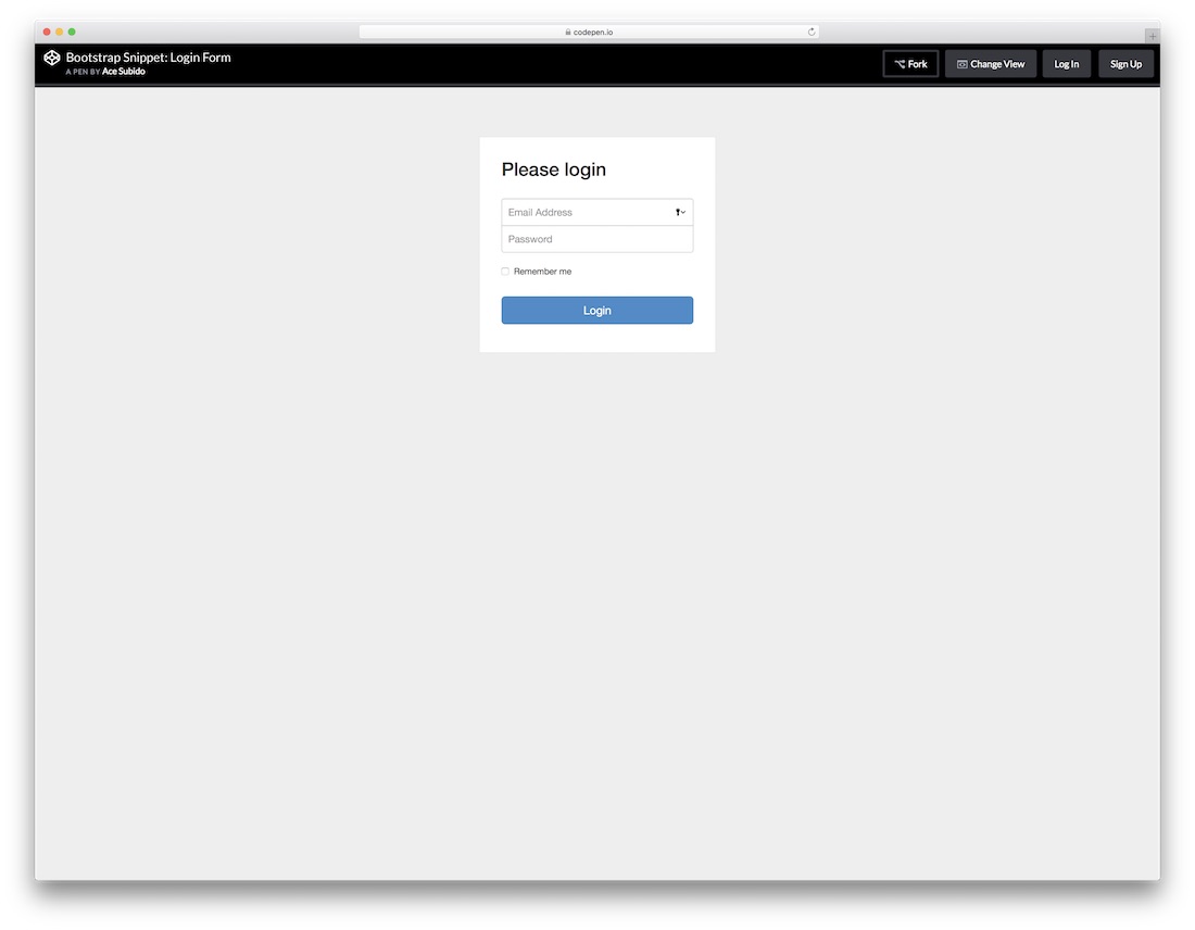
Obviously, this next free HTML5 login form is based on the well-liked Bootstrap Framework. This tells you that you can expect some nice flexibility that any modern website and element must practice. Email address, password and a check box to tick if a user would like the platform to remember his or her information. Easy and to the point.

Regardless of your main web design, with things like login forms, you do not want to over complicate it. Instead, you would want to keep it simple and let it to the job, getting users to access their accounts seamlessly. You will achieve that goal with this login form with flat UI unquestionably.
Trendy UI Kits Form

From super simple login forms to those with slightly more action going on. This particular one is pretty similar compared to the last one just that you will notice a frame going all around the form. Get them to type in their names or usernames and passwords and they can enter your world of amazingness.
Dashboard CSS3 HTML5 Form
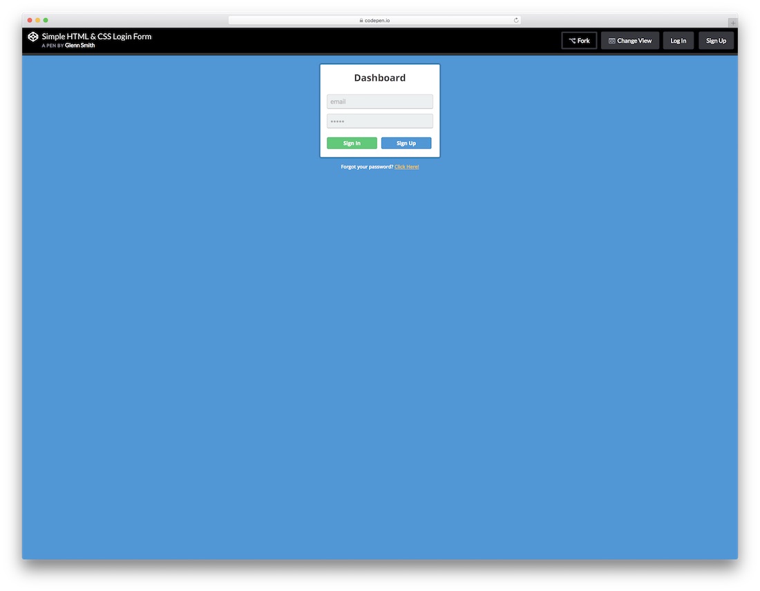
All the HTML5 and CSS3 login forms you find on this list are simple to use and effortless to attach to your web platform. This one even has a “Forgot your password?” right at the bottom for everyone who just cannot recall their passwords. The template is perfect for entering your dashboard, but you can apply it for other needs, too.
Login With Recovery Form

The title pretty much says it all; this is a neat, clean and minimal looking login form with recovery. What you also notice is that there is no traditional “box” that you are used to seeing login forms use. If you would like to make a difference, you now know which layout to choose.

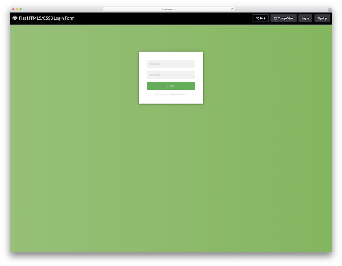
A free flat login form with a stunning and elegant dark layout coupled with a green call-to-action button. Sure, you can alter the tool to your likings, but you can also employ it exactly as is and have it live on your website in a snap. Play around with its features and have it all set up the way you like it.
Transparent Login
Even a login form can be of super creative and attention-grabbing nature. While many stick to the simple and basic look, there are others who like it special and exclusive. This transparent login form will surely do the trick for you. With an image background and a form over it, this layout can follow your branding to a T.

No need to be really going too in-depth with this next login since it is pretty self-explanatory. It is compatible with the Google Chrome extension, as well as features buttons for those who are not signed up yet or lost their password. If this is the one you were looking for, then scrolling all the way this far was more than worth it.
Elegant Flat Form

A stylish flat form which you can append to your web space as a pop-up or ad as a widget on a page. Whatever the case, it will keep your professional approach intact. It is simple and easy on the eye and also has a CTA for everyone who missed signing up to your members’ area. Use it as is or improve it according to your taste.

Definitely an approach to a free login form that you should not miss. It has a feel of a coupon just that it is not if that even makes any sense. Anyhow, in the text section, you can also link this form to the signup form for those interested in creating an account. Other than that, it surely will capture their attention.

More and more website owners are implementing social logins and you can join the trend as well. This free login form with social integration is the right option to take the plunge. However, along with Twitter, Facebook and Google+ buttons, the layout also features the traditional way of signing up with an email.
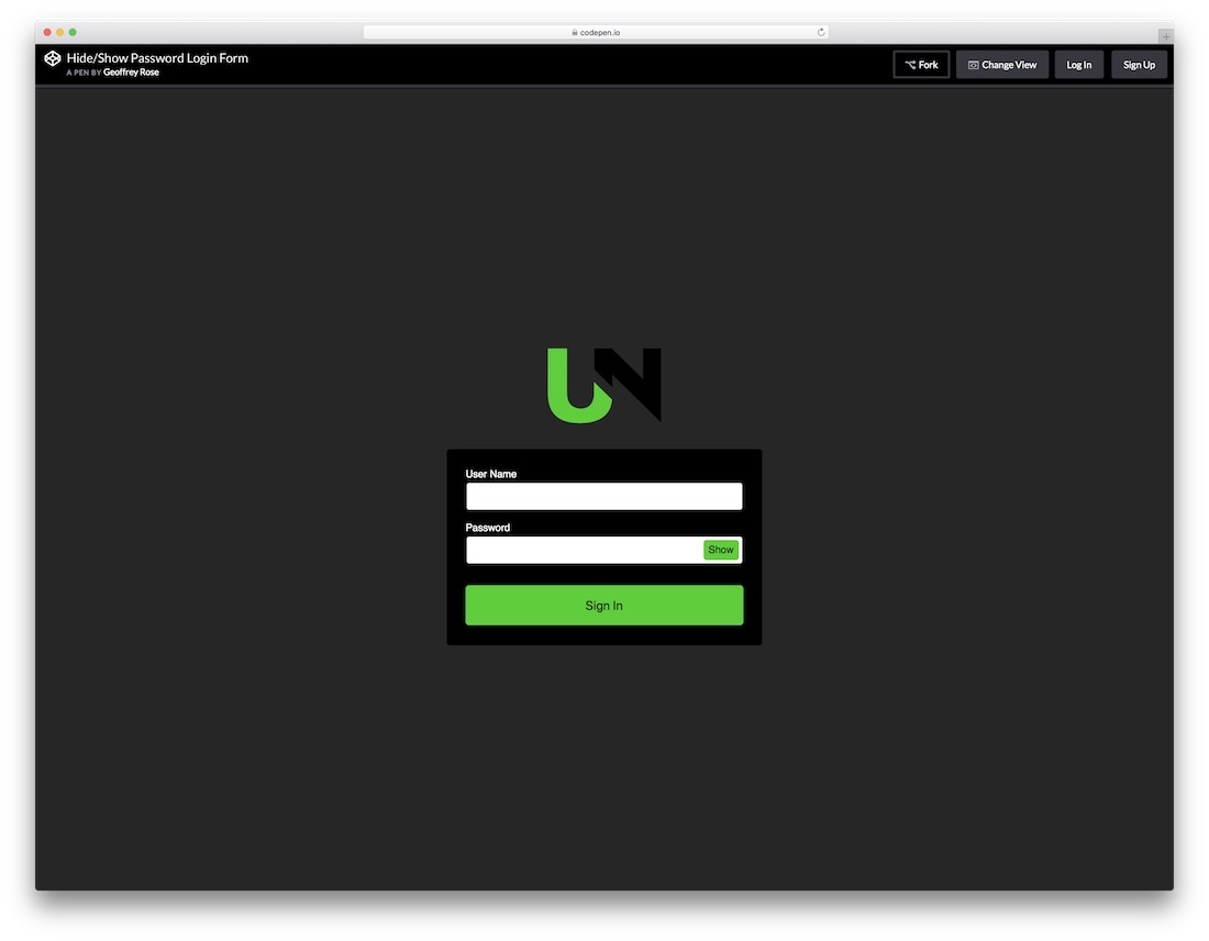
If your password is super complex, you sometimes just want to enter it in a “show” mode. Offer this same feature to all your users with the show and hide password login form. It has a stunning dark layout with green details perfect for those who dig this type of designs. Of course, feel free to make changes to it and fine-tune it according to your needs.
Log ‘N Load Animated Form

If you already practice animations and special effects on your page, keep the trend with the login form, too. Instead of creating your own one, you can simply use this striking Log ‘N Load animated form that will do the trick. Once you hover over the login button, the form reveals right in front of you. It even has a circular loading that enhances the experience.

This flat, modern and easy to use login form works great on all devices, mobile, tablet and desktop. You can also play around with different tweaks and alter the default settings to your website’s style precisely. The tool also has cool hover effects that add a touch of sophistication to the overall experience.

A free HTML5 and CSS3 login form with a bright layout that will get your login section sorted out in full. Add this widget to your page, activate it and let all your users and members enter their accounts. Warm colors, “remember me” section and a title along with email and password fields, that’s all you need.